ZSA Moonlander
Brand Identity & Campaign For A High-Tech Keyboard
The existing visual language relied heavily on skeuomorphic elements and lacked a clear contemporary identity.
This project builds a simplified brand identity and a campaign concept that reflects the keyboard’s modular design philosophy and technical character.
Brand Direction
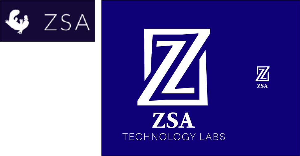
The brand direction focuses on clarity and modularity, reflecting the engineering mindset of programmable keyboard users.
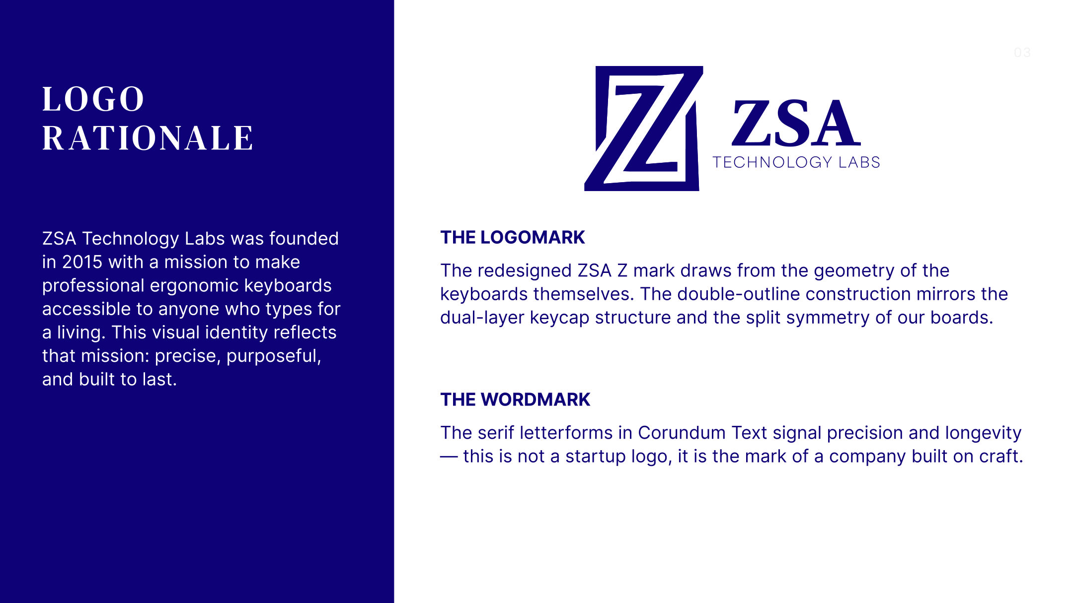
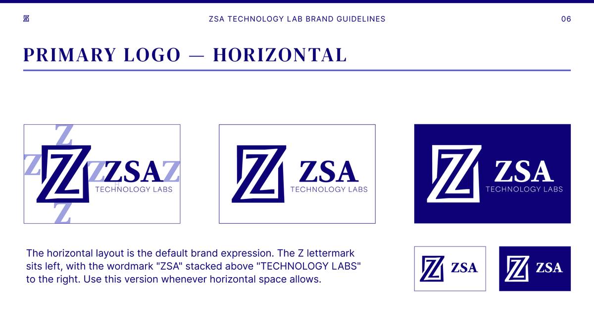
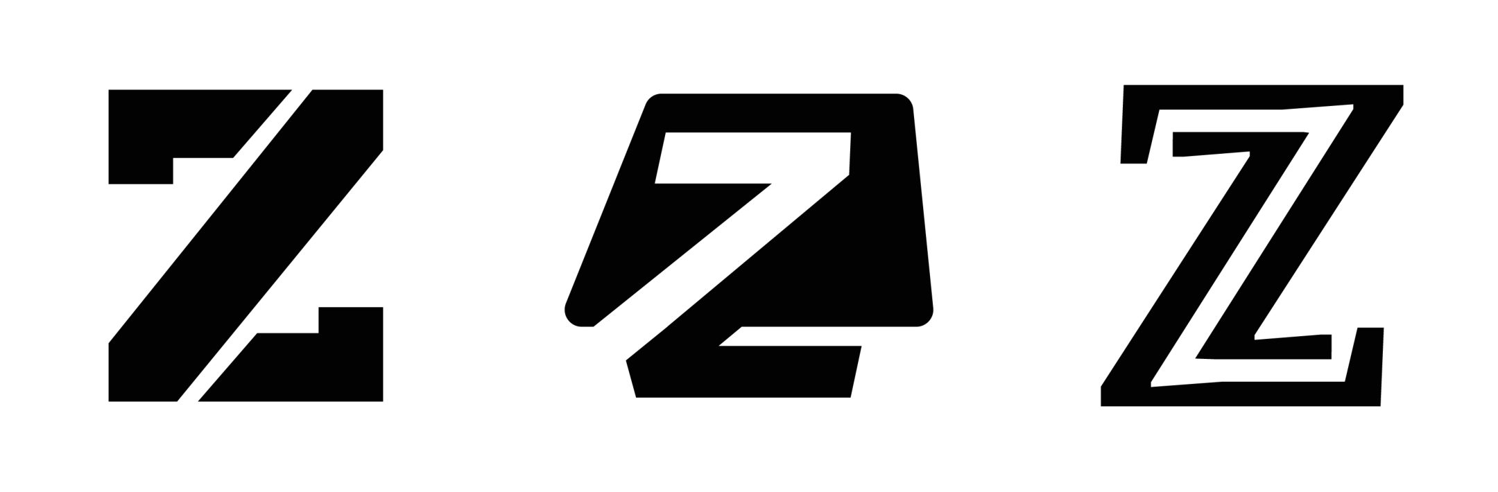
A simplified logomark replaces the previous skeuomorphic logo. Its double outline follows the two-layer keycaps and the split layout of the boards, and it stays clear at small sizes.
The wordmark is set in a serif, Corundum Text Bold, which reads as something built to last rather than a tech startup.
Identity System
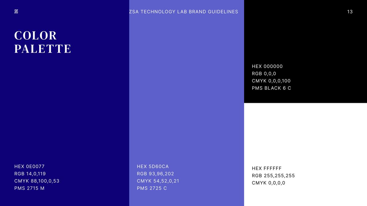
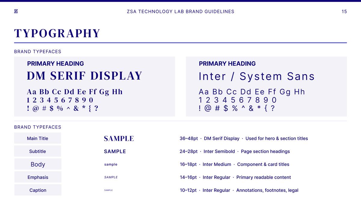
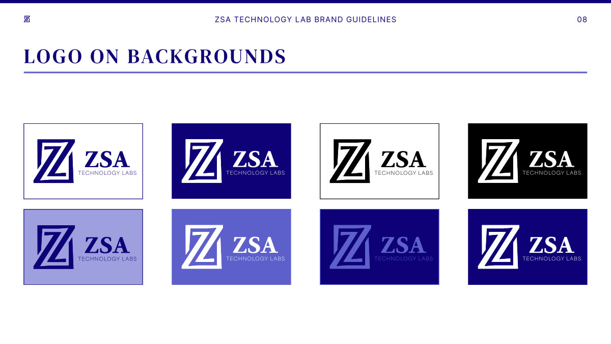
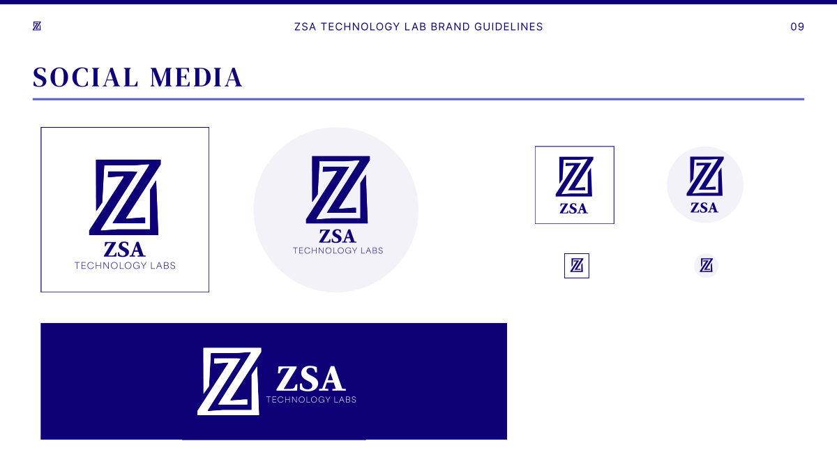
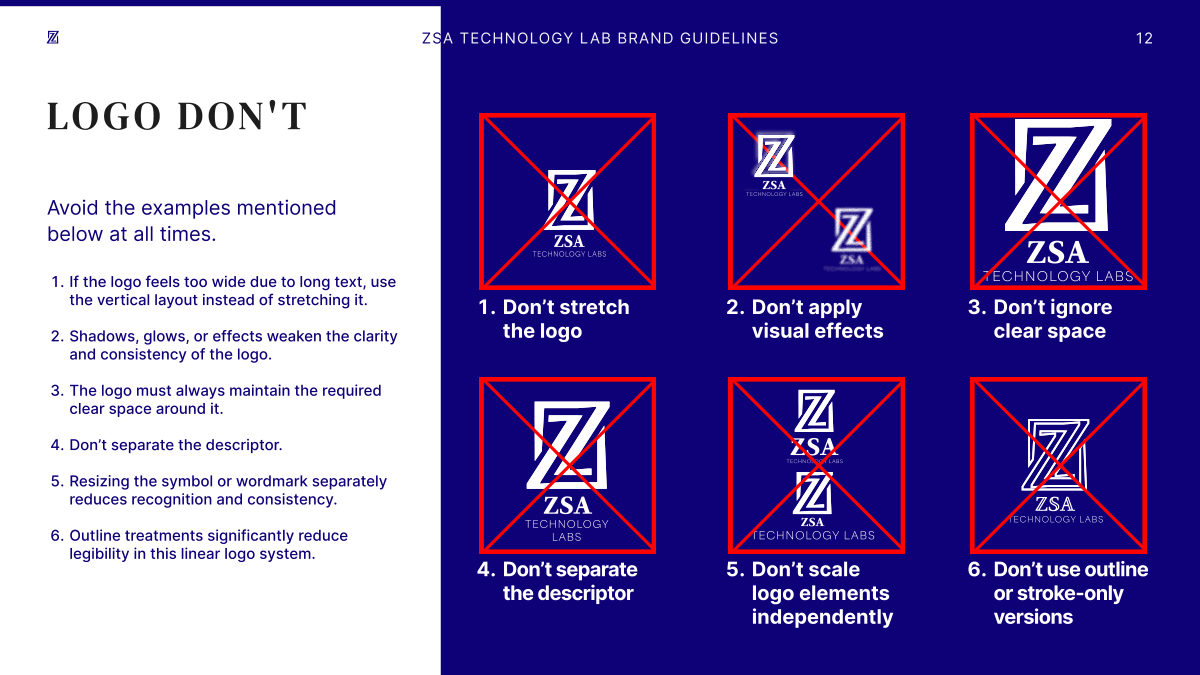
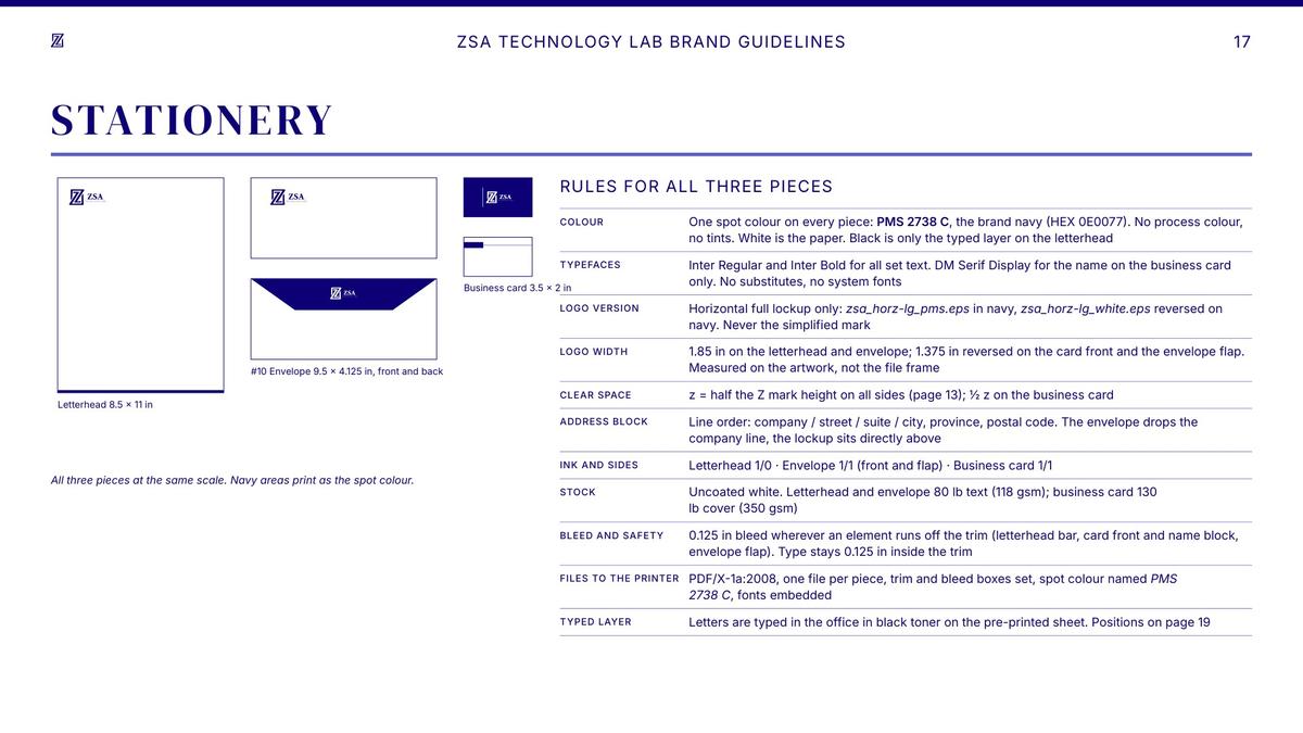
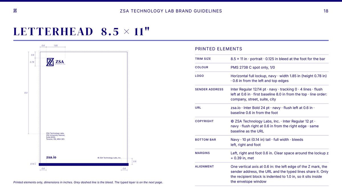
The guidelines set out the lockups and their minimum sizes, the logo on different backgrounds and as a social media avatar, and the misuses to avoid. Deep navy is the base colour, with mid purple as a small accent that never competes with it. DM Serif Display and Inter carry communication and stay separate from the logo type.
Applications
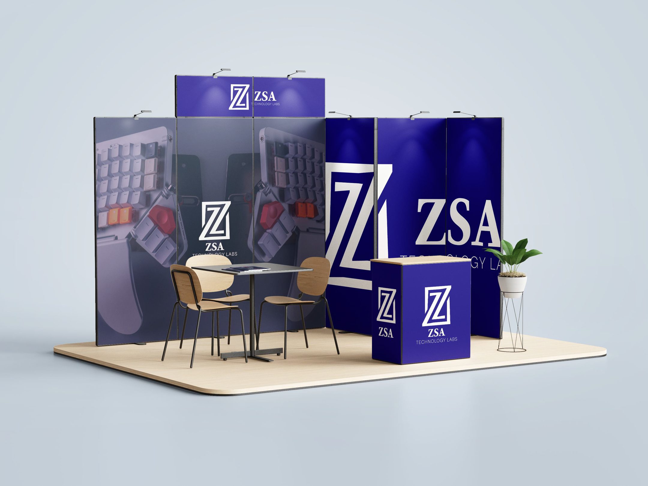
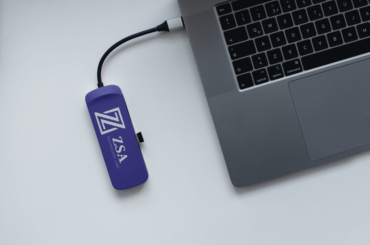
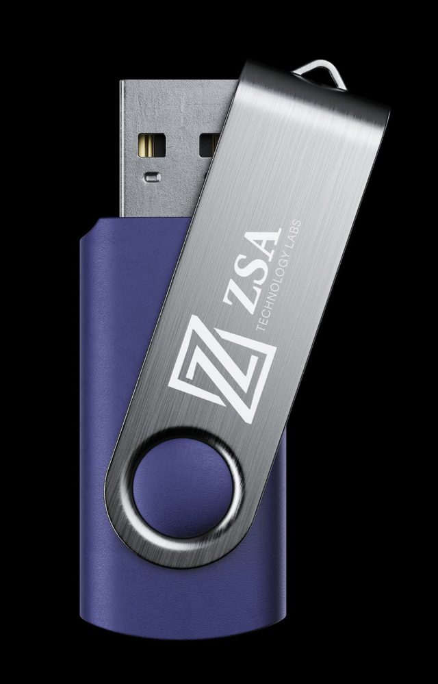
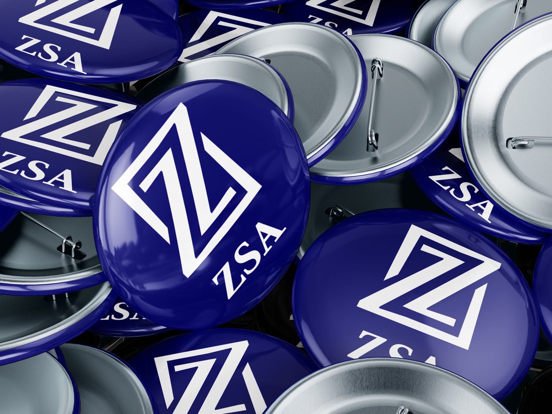
The identity on a trade-show booth and on merchandise: a USB-C adapter, a USB stick and badges.
Campaign
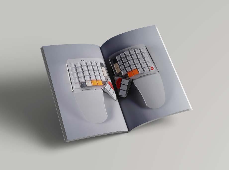
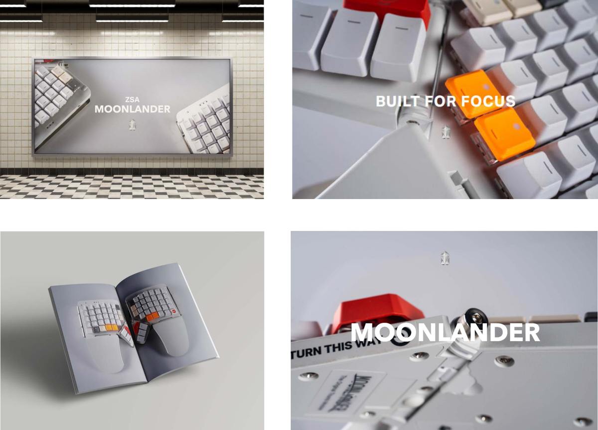
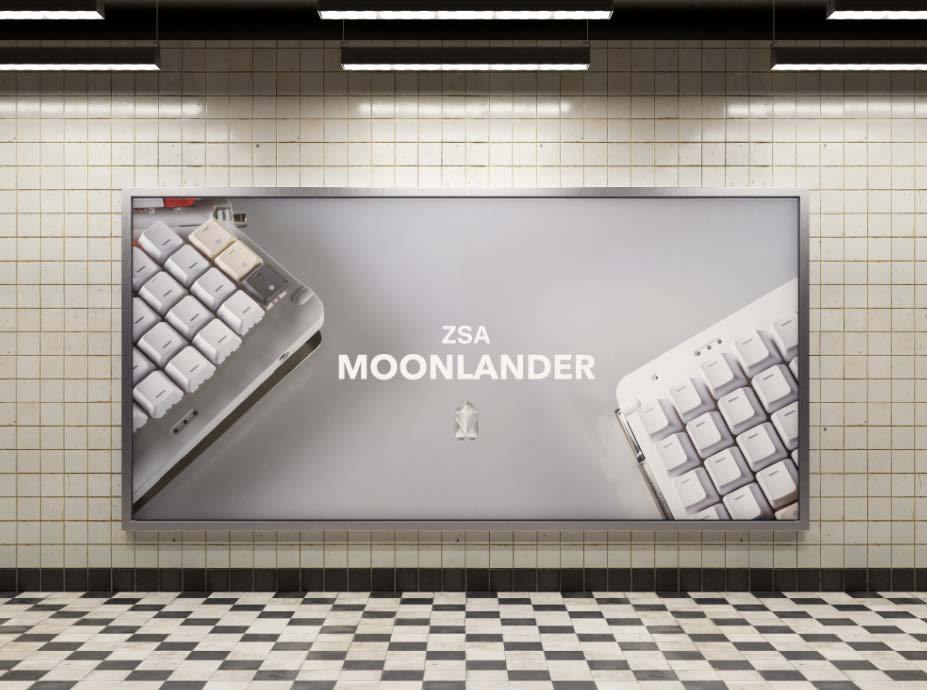
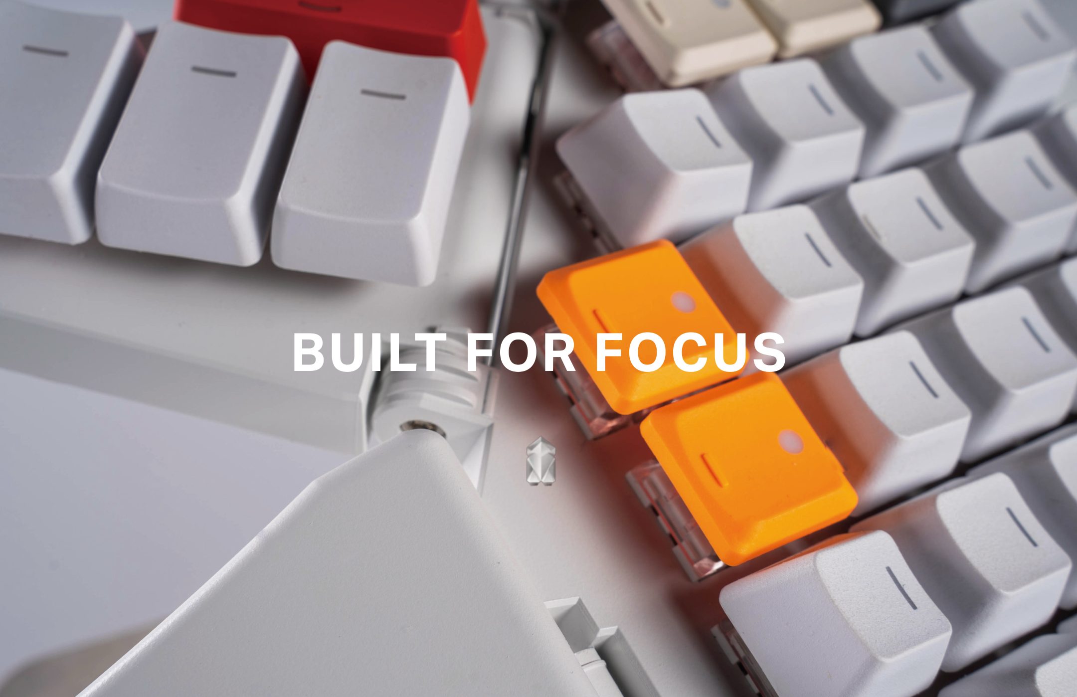
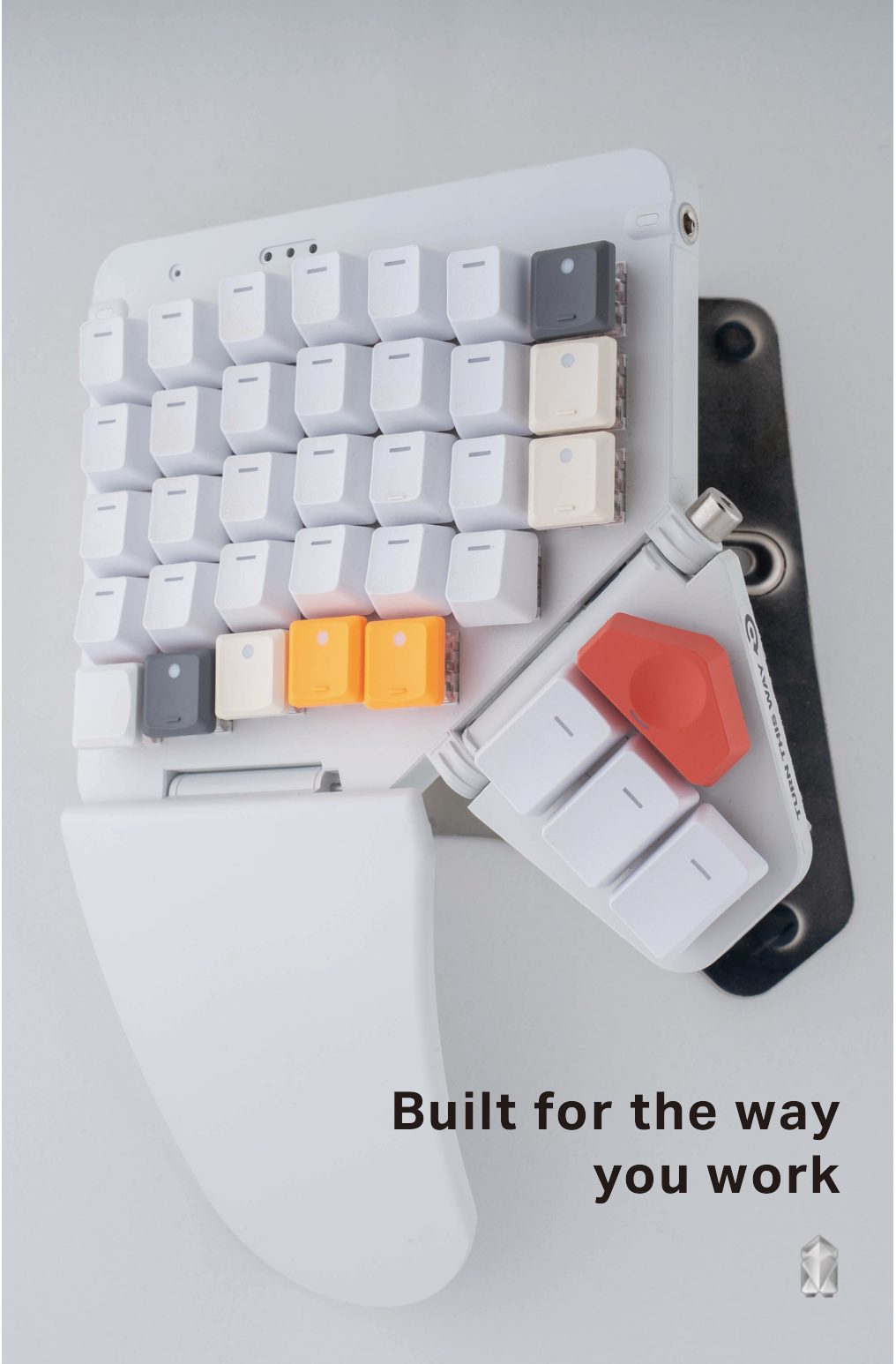
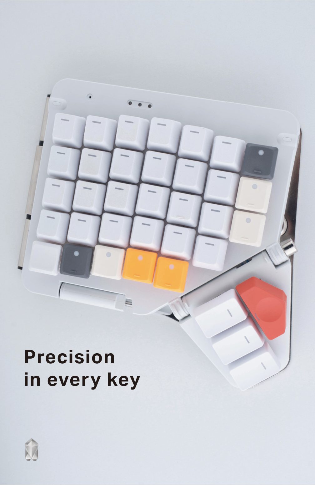
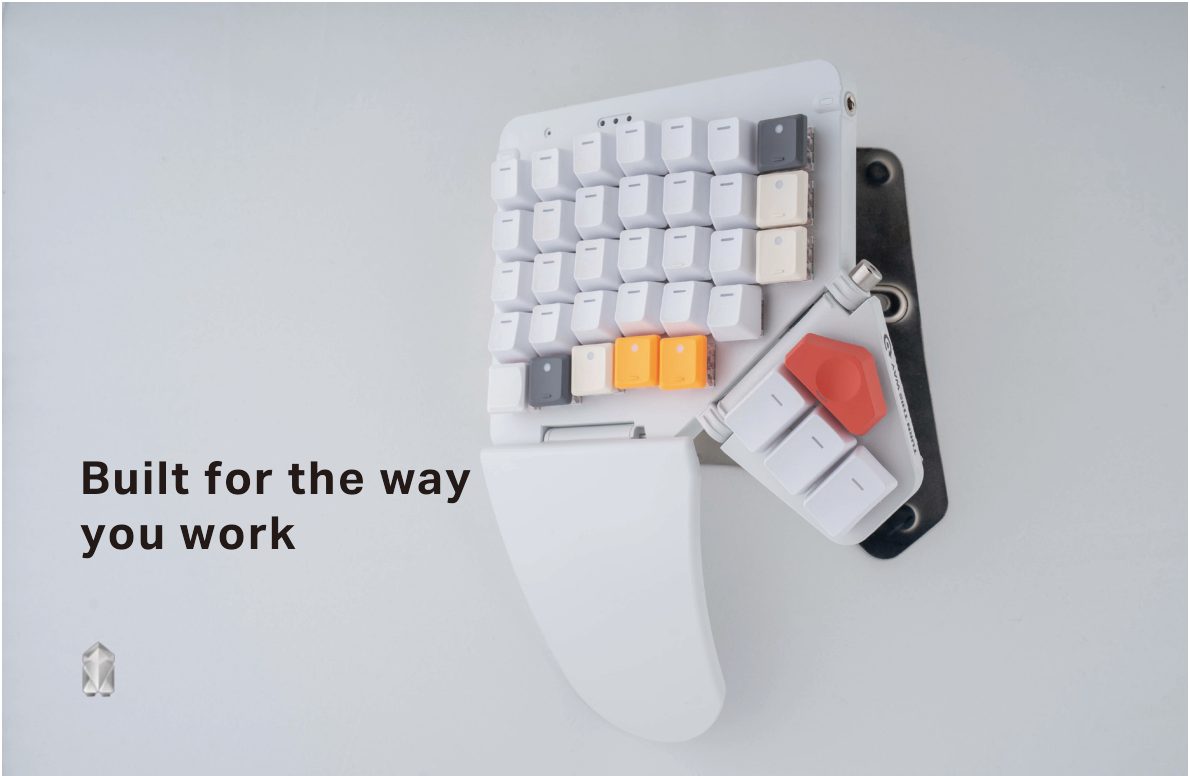
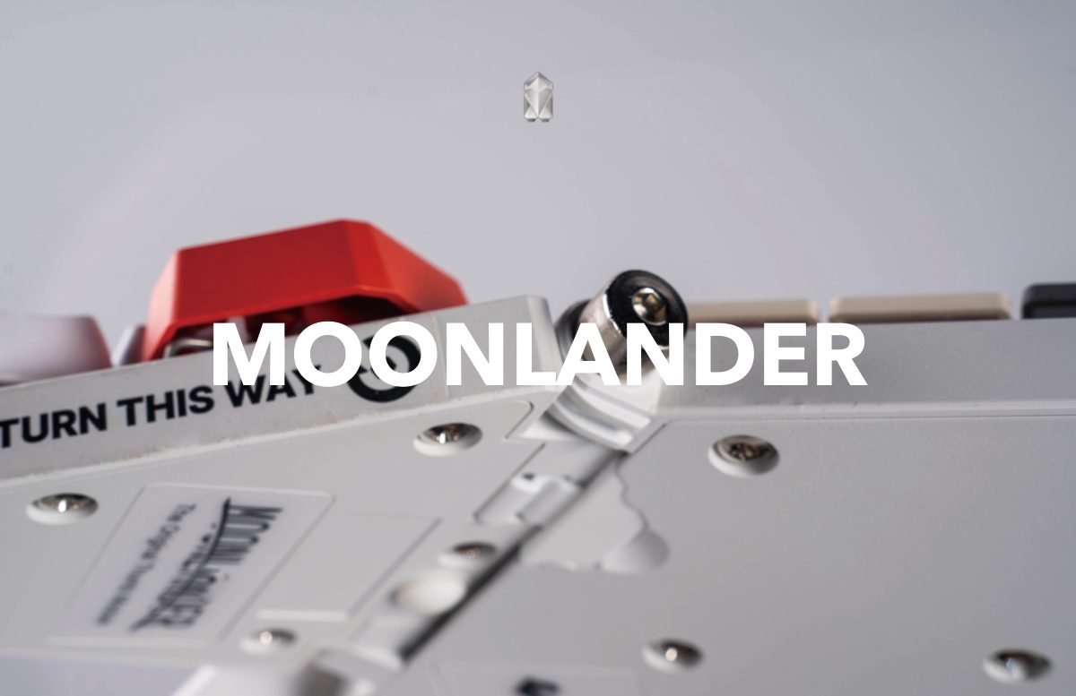
Through bold compositions and close-up product visuals, the design emphasizes precision, customization, and the tactile experience of mechanical keyboards.
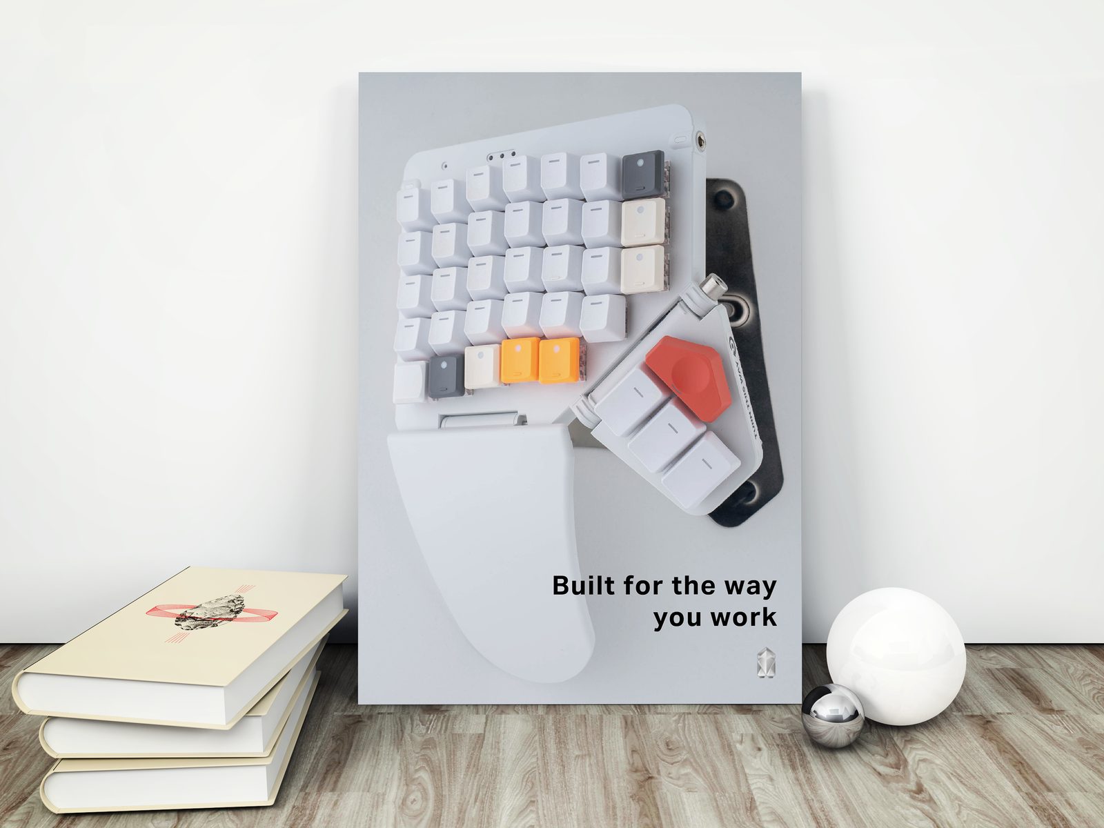
The visual system extends across multiple campaign touchpoints including billboards, editorials, and social media graphics, maintaining a consistent visual language built around precision and modular structure.
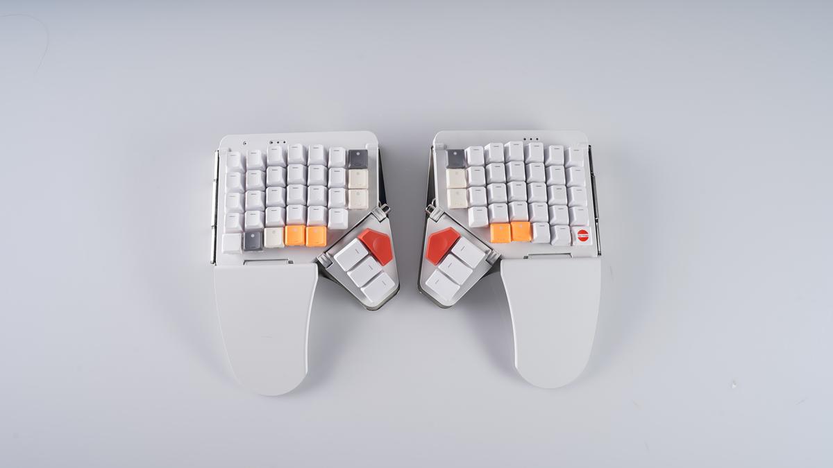
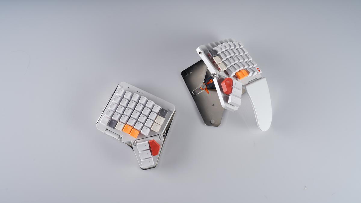
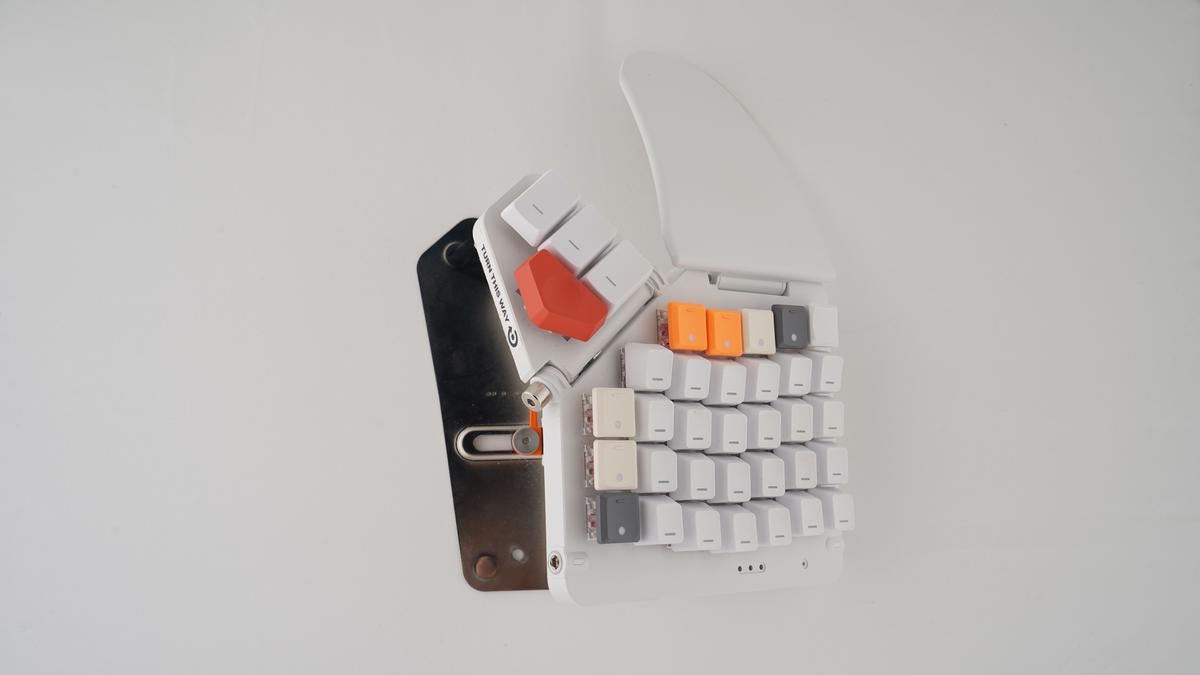
The campaign images were made for a photography course and carry the keyboard’s own icon, not the new Z mark. I shot the keyboard myself in the studio, every frame at f/11, 1/160 s and ISO 80.
Sketches
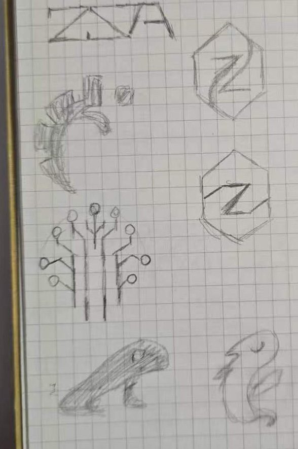
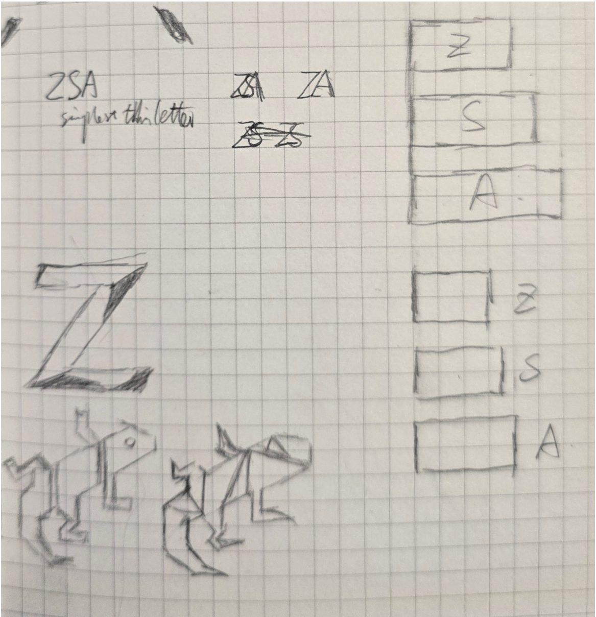
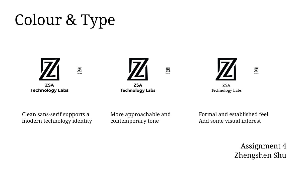
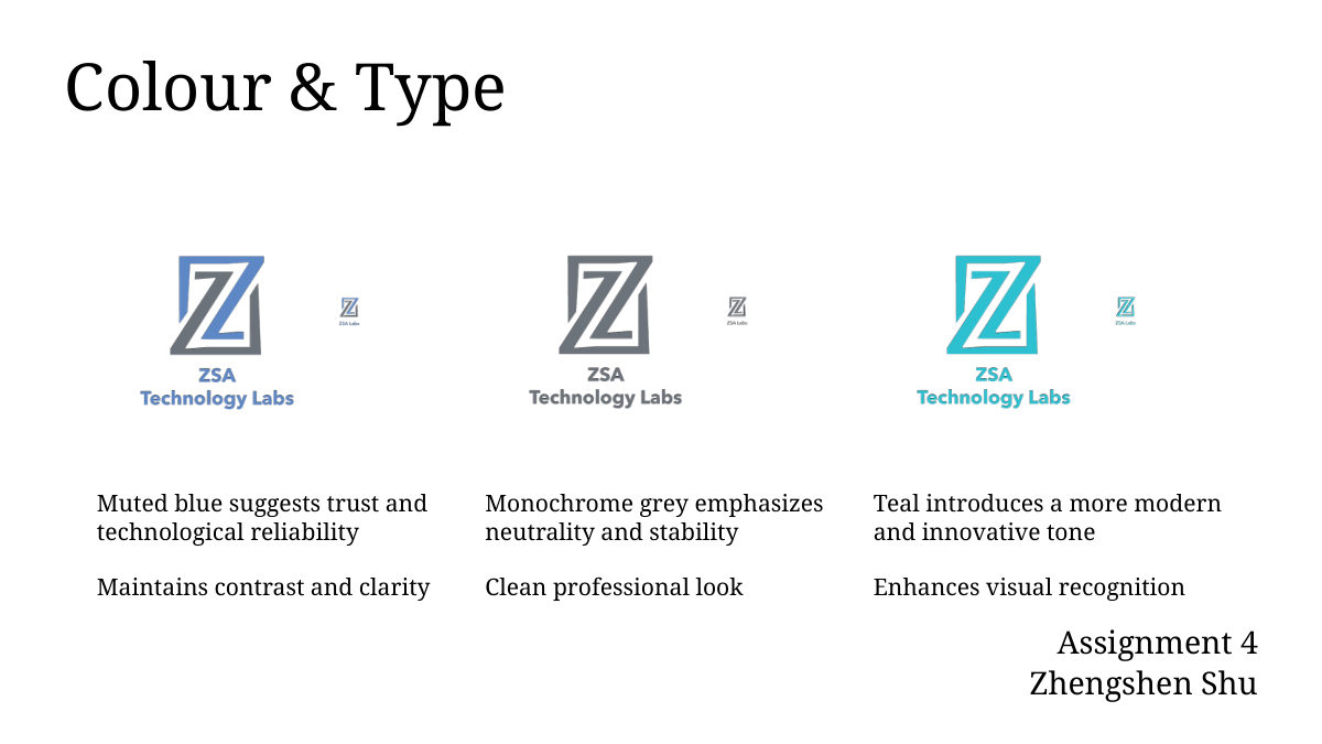
The Z started as pencil sketches on grid paper. Three digital directions followed, then tests of the wordmark in sans and serif type and in muted blue, grey and teal.
Process
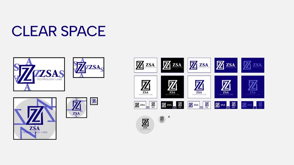
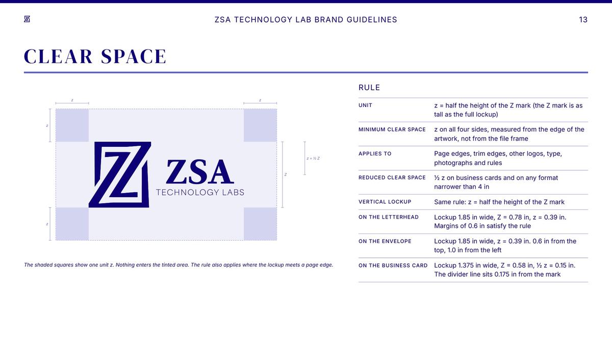
The clear space page as drafted in March and as revised in September, when the rule was drawn out and stationery and letterhead specs were added. Below, unedited shots from the product shoot.