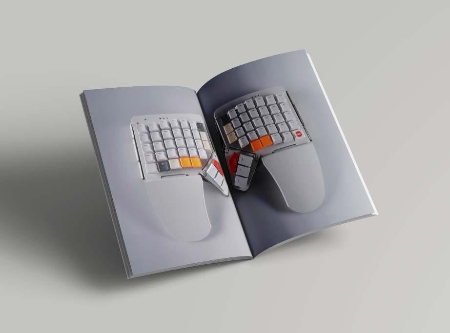
ZSA Moonlander
Brand Identity & Campaign For A High-Tech Keyboard
The existing visual language relied heavily on skeuomorphic elements and lacked a clear contemporary identity.
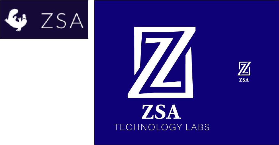
This project builds a simplified brand identity and a campaign concept that reflects the keyboard’s modular design philosophy and technical character.
Brand Direction
The brand direction focuses on clarity and modularity, reflecting the engineering mindset of programmable keyboard users.
A simplified logomark replaces the previous skeuomorphic logo. Its double outline follows the two-layer keycaps and the split layout of the boards, and it stays clear at small sizes.
Identity System
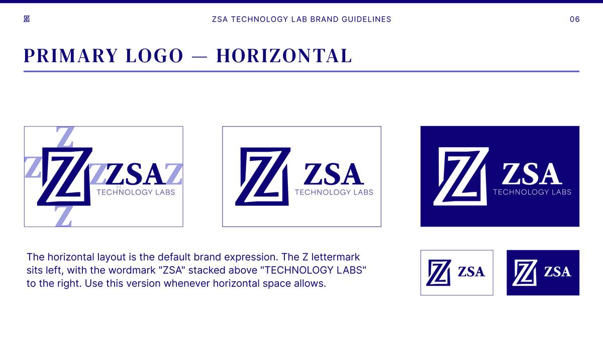
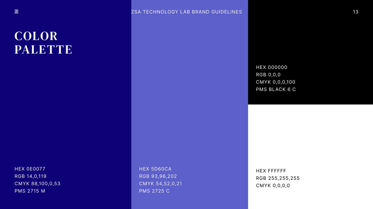
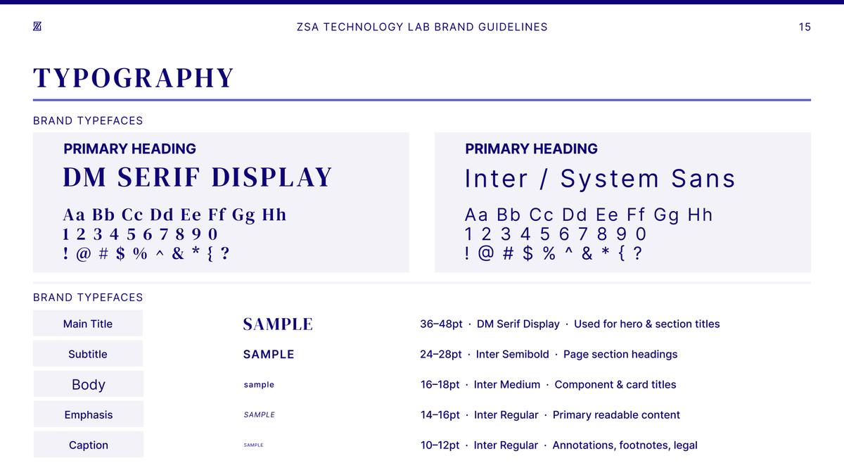
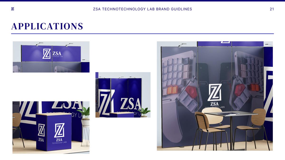
The guidelines set out lockups, a deep navy palette, DM Serif Display with Inter, and applications from print to a trade-show booth.
Campaign
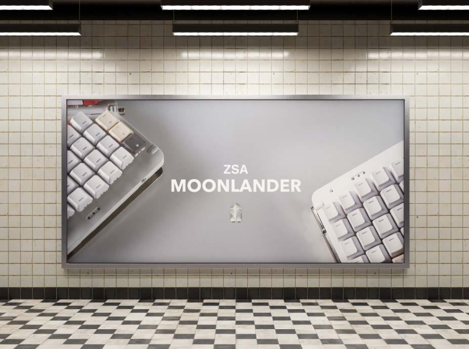
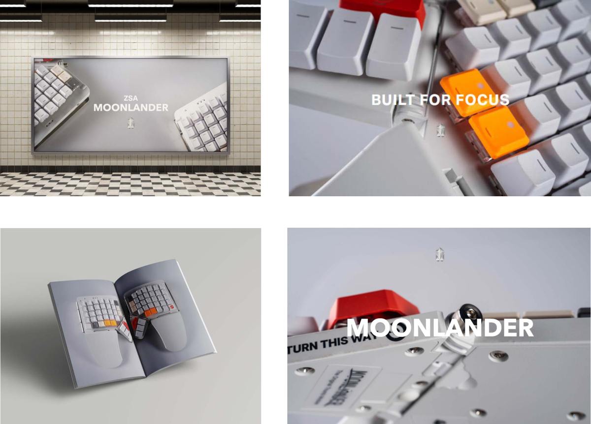
Through bold compositions and close-up product visuals, the design emphasizes precision, customization, and the tactile experience of mechanical keyboards.
The visual system extends across multiple campaign touchpoints including billboards, editorials, and social media graphics, maintaining a consistent visual language built around precision and modular structure.