Greeting Cards
A Greeting Card System In Three Languages
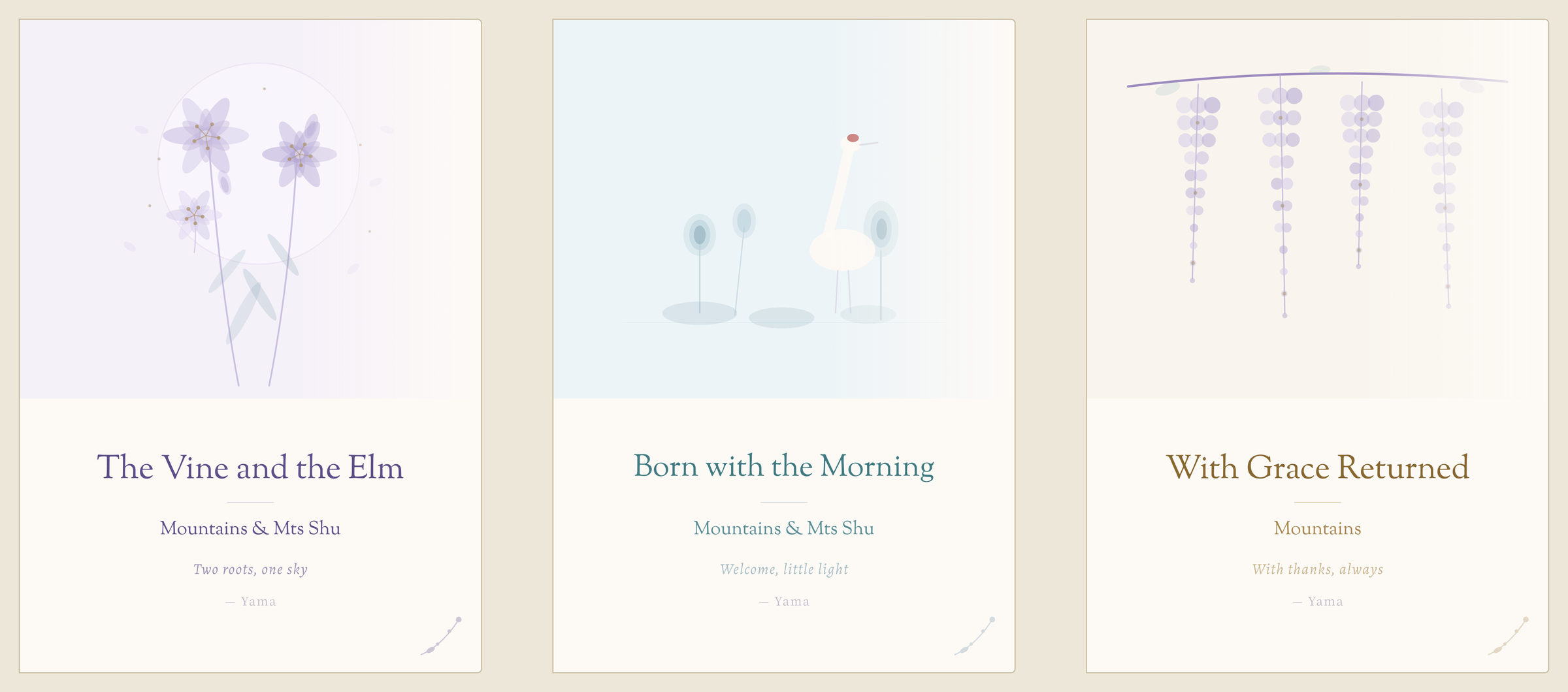
A personal greeting card system for MX Studio: three folded cards for a wedding, a newborn and a thank-you, with matching hang tags.
Each card works in English, Chinese and Japanese, with lily, crane and wisteria illustrations, a 16-colour palette and one type system across the three scripts. Printed on 300 gsm matte stock.
Three Languages
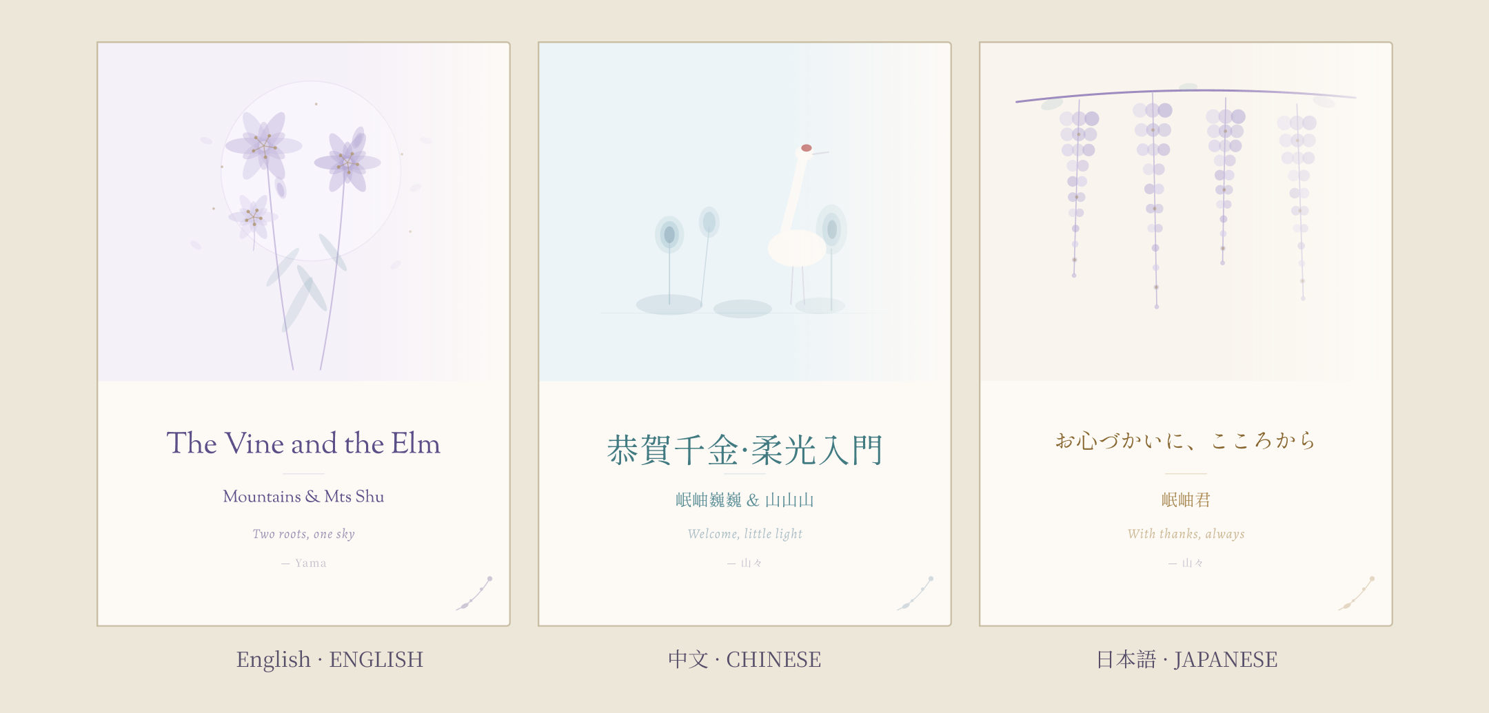
Every card exists in Chinese, Japanese and English. The illustration, palette and layout stay the same, while the title, the names and the message change with the language.
Chinese titles are set in traditional characters, and the signature is written in the card’s own language. All names shown on the cards are placeholders.
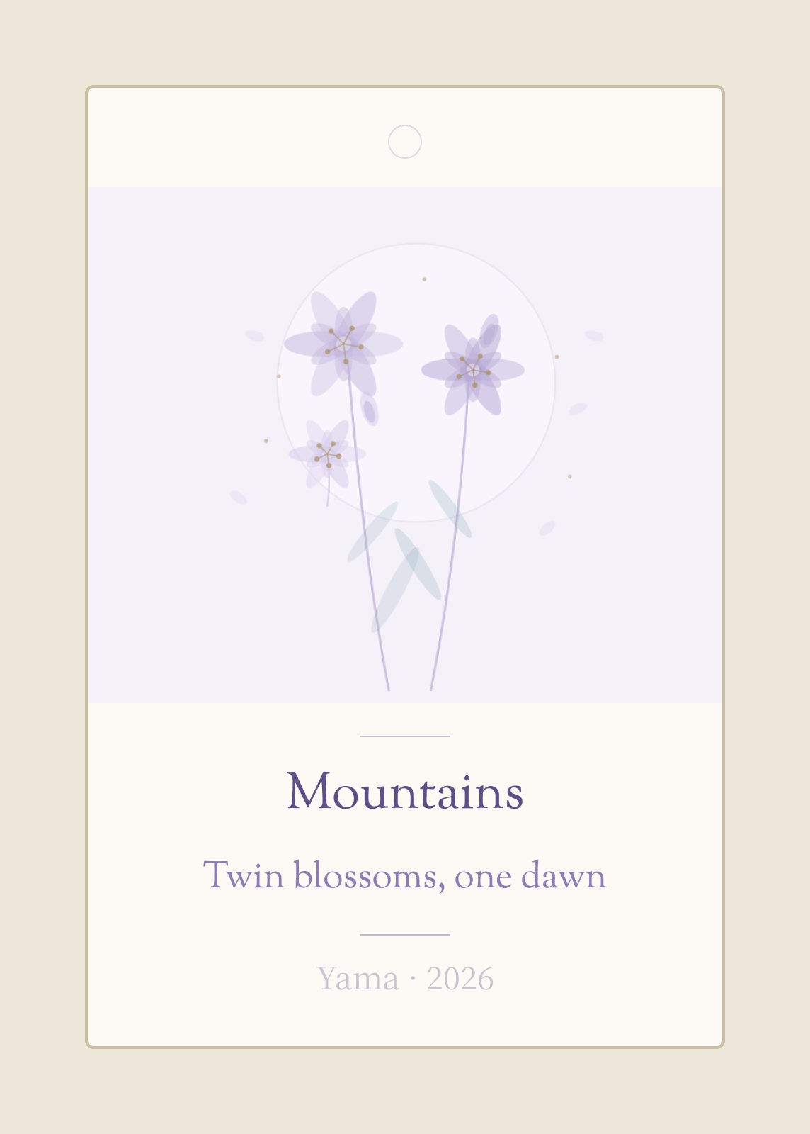
Card System
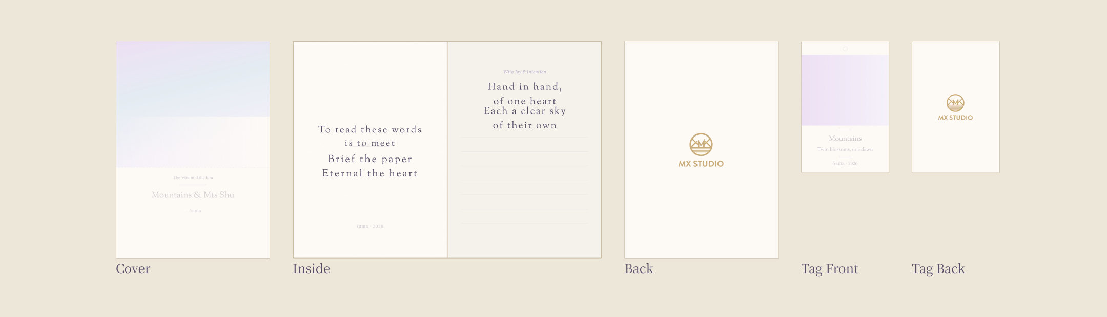
Each card folds to 105 × 148 mm and opens to a 210 × 148 mm spread. On the cover, the illustration takes the top 58% and the text sits in the lower 42%.
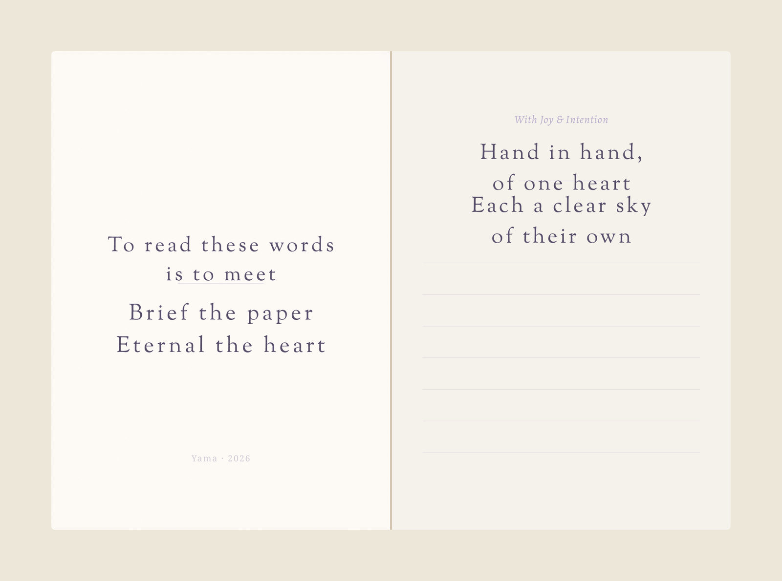
Inside, the left page is the same on every card; in English it reads “To read these words is to meet. Brief the paper, eternal the heart.” The right page carries the card’s own message, with lines below for writing by hand.
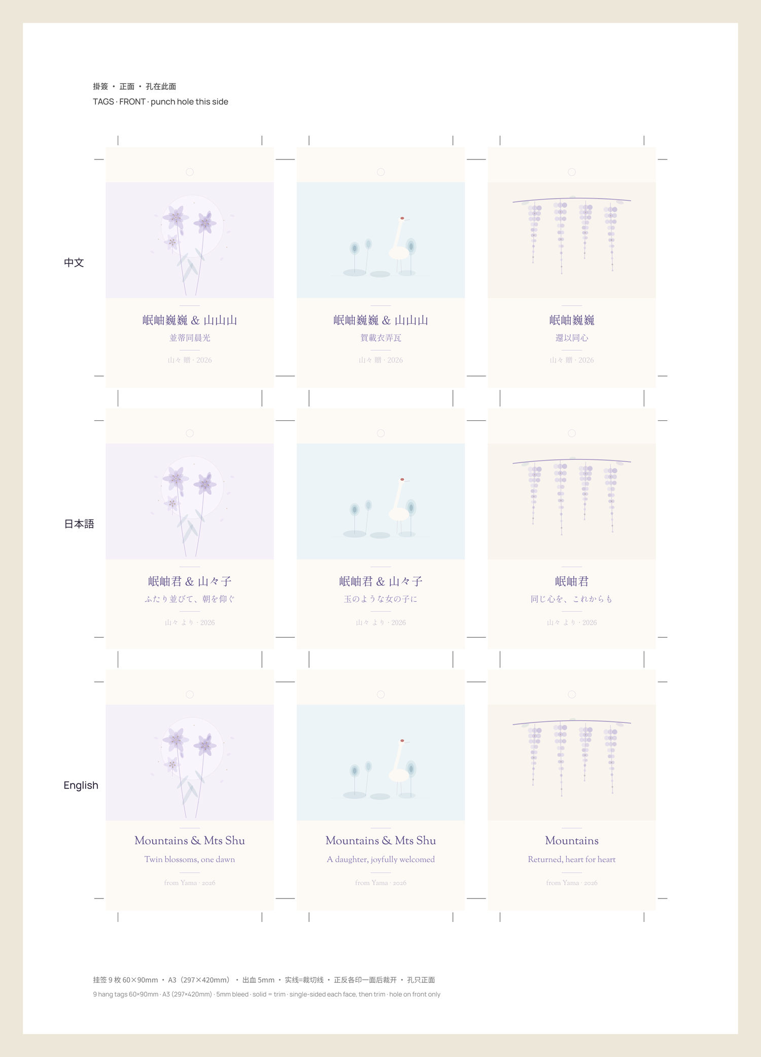
Each card comes with a matching 60 × 90 mm hang tag for gifts. The back cover and the back of the tag carry only the MX Studio mark.
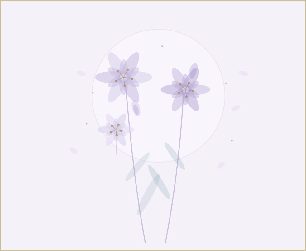

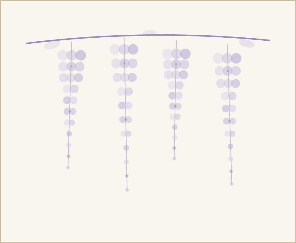
Illustrations
Three vector illustrations, one for each card: lily for the wedding, crane for the newborn and wisteria for the thank-you. Each fills the top of its cover and appears again on the card’s hang tag.
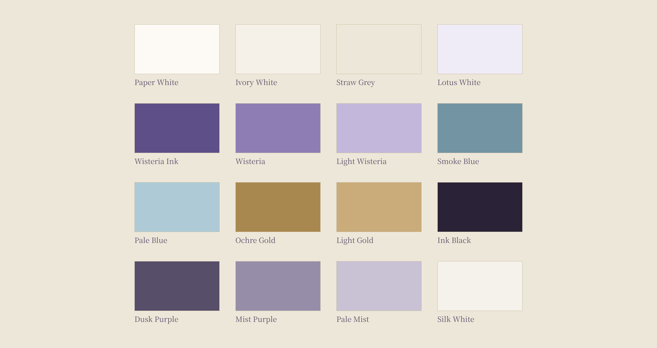
Colour
The sixteen colours work in two layers. A fixed base runs through every card: warm white paper, a purple-toned ink for text and gold for the signature and the MX Studio mark. On top of it, each card takes one colour family from its own imagery: lavender for the wedding, smoke blue for the newborn, and gold and purple for the thank-you.
Each family is kept quiet, with low saturation and three steps from dark to light. The palette leaves out bright and neon colours as well as pure black and pure white, and gold is never used as a fill.
Type
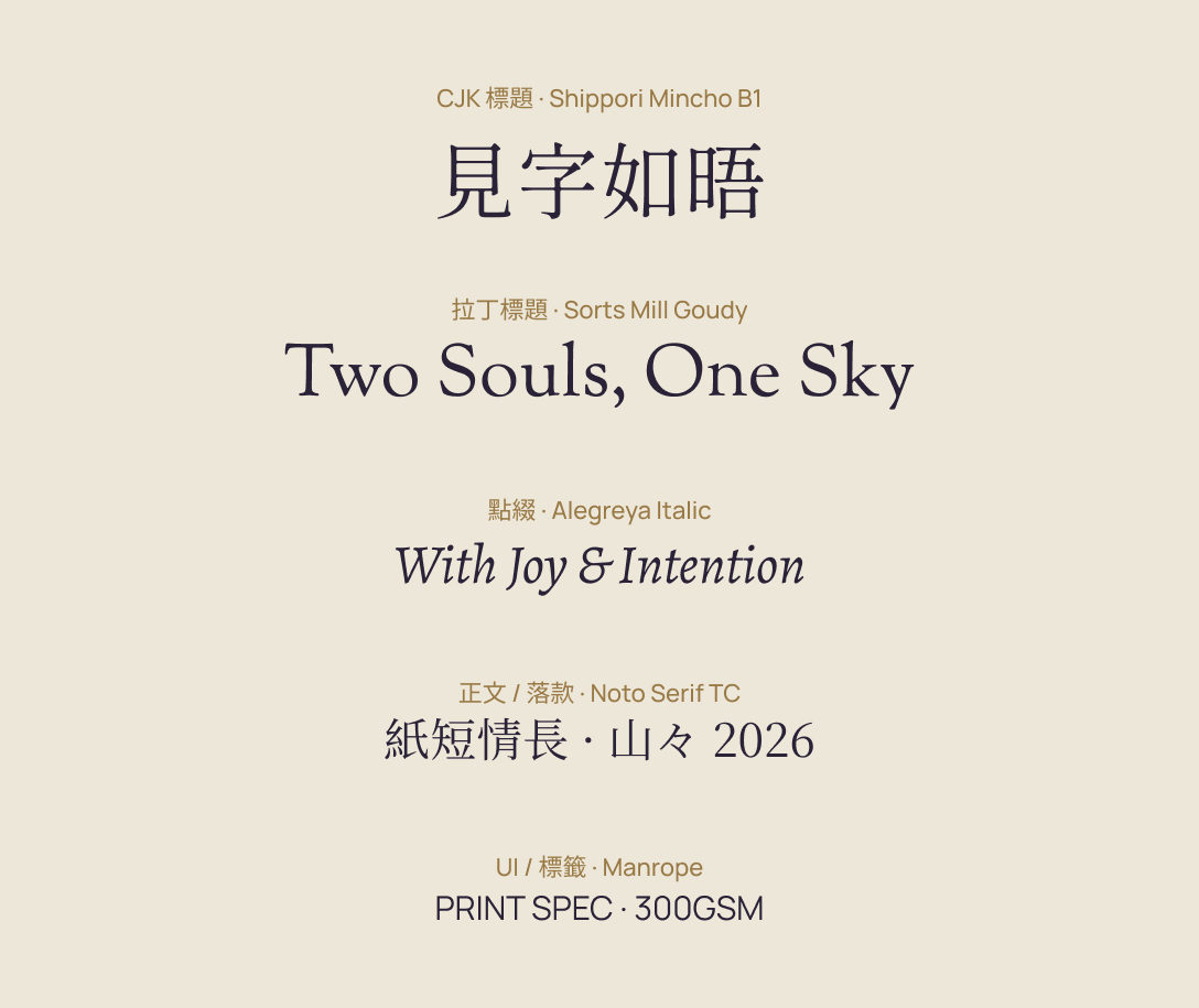
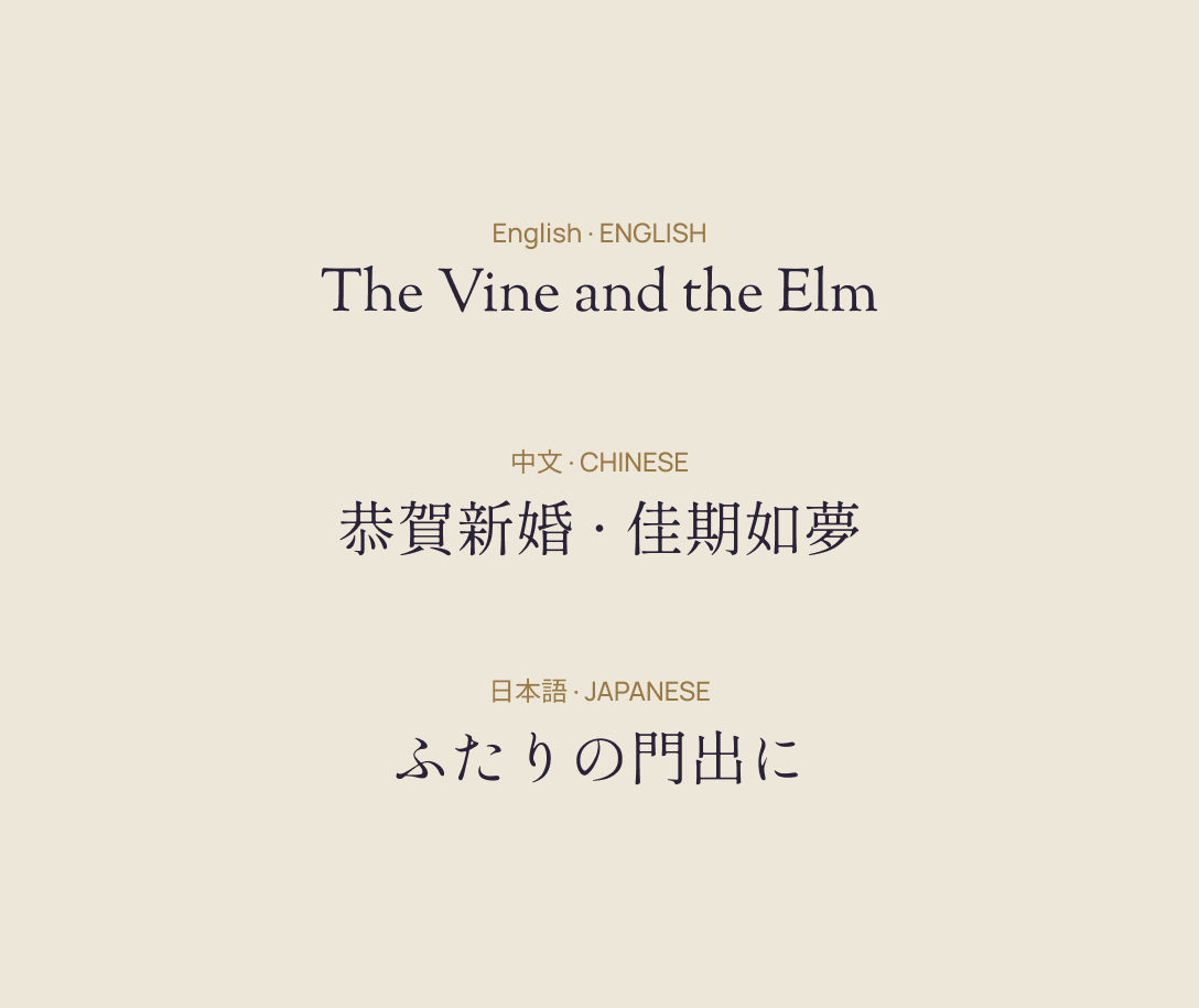
Typefaces are assigned by script. Chinese and Japanese titles are set in Shippori Mincho B1 and English titles in Sorts Mill Goudy, with Alegreya Italic for accents. Body text and signatures use Noto Serif TC in Chinese, Noto Serif JP in Japanese and Noto Serif in English, and labels use Manrope.
The panel on the right sets the wedding card’s title in all three languages.
Signature
The studio and the sender sign in different places. The back cover and the back of the tag carry only the MX Studio mark, centred, with no name or year. The year appears just twice, on the inside left page and in the tag’s signature, and never on the cover.
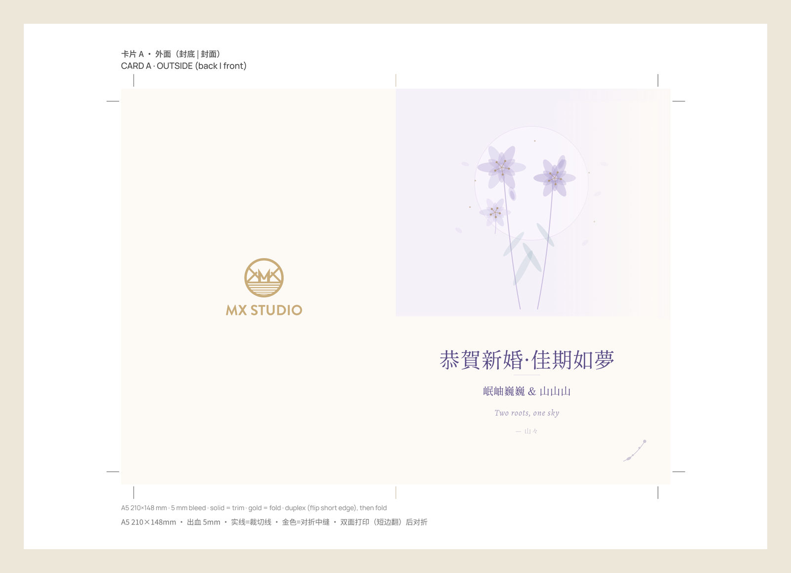
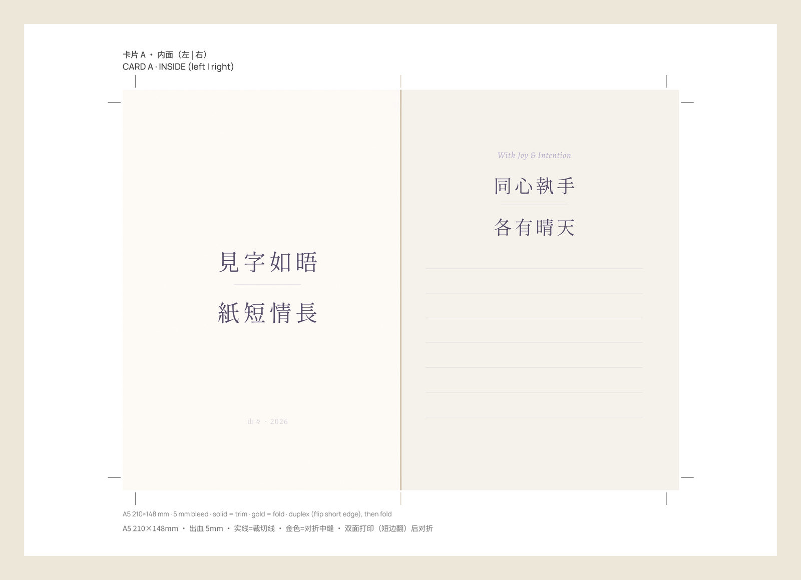
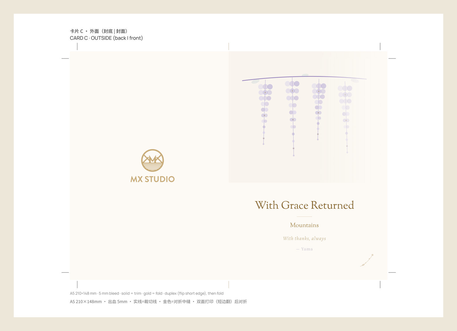
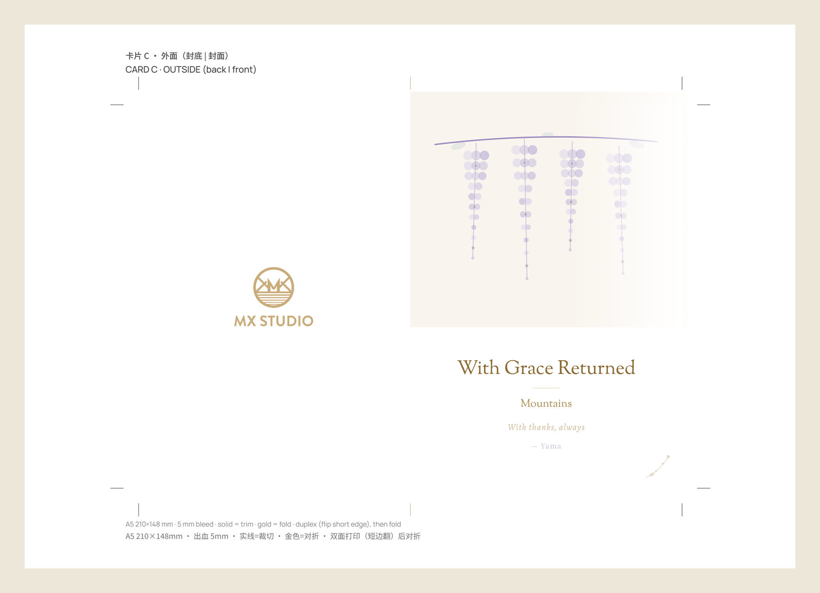
The print files set each card’s flat spread on an A4 sheet with 5 mm of bleed. Solid lines mark the trim and gold ticks mark the fold; the sheet is printed on both sides, flipped on the short edge, then folded.
Nine 60 × 90 mm hang tags in three languages share an A3 sheet with the same bleed, and only the fronts are punched. The backs, with the MX Studio mark, print on a second sheet, mirrored to line up with the fronts.
Every sheet also comes in a no‑background version for printing on textured paper, with the cream paper left white; the thank-you card is shown both ways. Print files are shown with placeholder names.
Social Slides
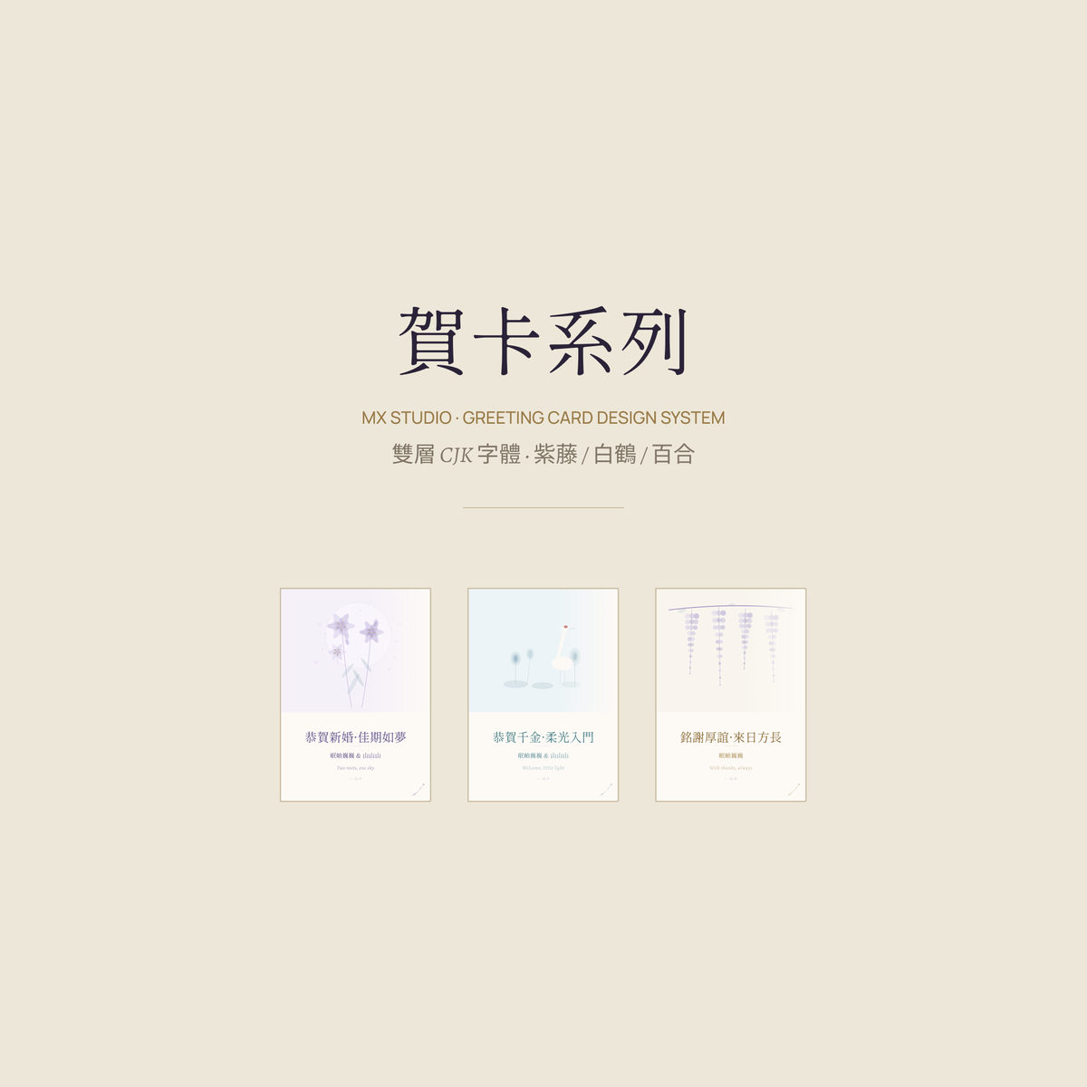
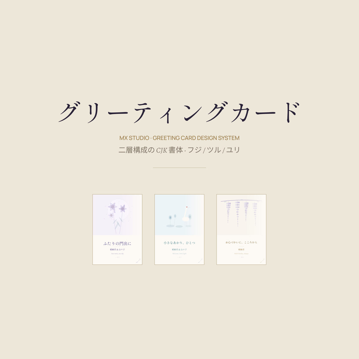
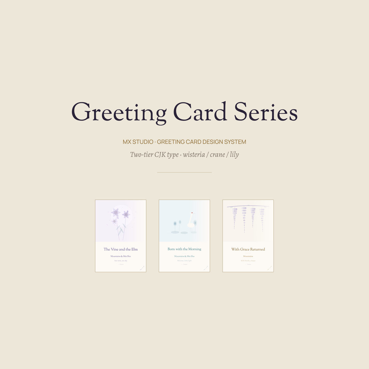
For social media, the series runs as nine square slides in each language: a cover, the three cards, the languages side by side, components, illustrations, palette, type, the titles in three scripts and the back cover. Shown here are the Chinese, Japanese and English covers.